TABIYA SERVICES
WEBSITE REDESIGN
& BRAND REFRESH

Summary
Tabiya Services is a management consultancy offering professional development through executive coaching, team workshops, and business advisory. The existing website was dated and no longer reflected Tabiya’s evolving service focus. Our team was engaged to lead a full front-end refresh — from redefining user needs to redesigning the brand’s visual identity.
Objectives
Refresh the front end of Tabiya to present a better face to a broader client base
Recommendations on how best to apply the new work in a future marketing campaign (marketing campaign out of scope)
Problem Statement
Professionals seeking the best coaching and advice for themselves and their business are struggling to understand if Tabiya is a match, based on what they see on its website.
The lack of clear service offering, the disconnect between the brand and the expertise behind it, and the website’s outdated appearance leave them feeling hesitant to engage, ultimately hindering Tabiya’s growth.

My Contribution
Role: UI/UX Designer on Design Team, Logo and Brand Designer
Team: Cross-functional UI UX team
Duration: 4 weeks
Tools: Figma, Figjam, Illustrator, Miro, Photoshop
Conducted UX design research and helped synthesise research findings
Participated in information architecture restructuring and wireframing
Artifact and design system element creation
Created high-fidelity UI mockups for key website screens
Co-led the logo redesign process; my concept was selected and is now in use
Contributed to brand visual refresh including layout, typography, and chess theme integration
UX Approach
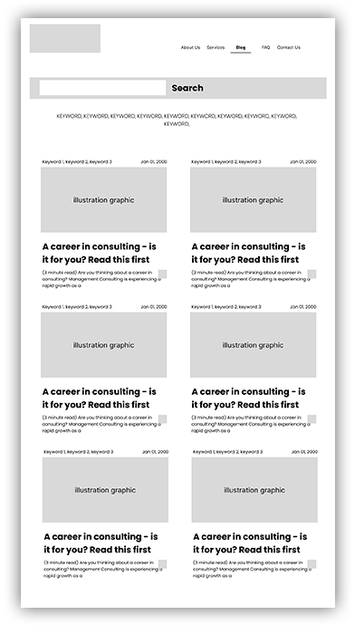
We prioritised clarity and usability for Tabiya's diverse user groups: business leaders, HR professionals, and individuals seeking coaching. The new site structure reduced complexity and improved accessibility, retaining valuable blog and partner content.

Brand & Logo Redesign
I developed multiple logo options aligned with Tabiya’s brand themes of strategy and professionalism. The final chosen logo retained the chess motif in a more refined and scalable form.


Outcomes
The redesign established a stronger digital presence, with an aesthetic and structure that better serves both marketing and user needs. The work laid the foundation for future SEO optimisation and targeted outreach.
Learnings
This project deepened my experience across both UX and brand design. I learned how to balance stakeholder input with user-centric decisions and how to evolve a visual identity without losing core brand recognition.